Reimaging Information Access and Greater Community Engagement for:
INTRODUCTION
Project Overview
Transportation Alternatives (TA) is a non-profit advocacy group that promotes safe, equitable streets in New York City. In order to ensure a safer community, they engage in grassroots activism and research to decenter the automobile from New York's streets
Their website serves as both an informational hub about the organization, as well as a means for supporting and donating to TA.
In order to help Transportation Alternatives provide a more seamless user experience to its members, volunteers, and all NYC residents this project focuses on improving users’ ability to navigate the website more easily and find appropriate pages when they seek information about making donations, doing research, and finding information about data, and/or policies.
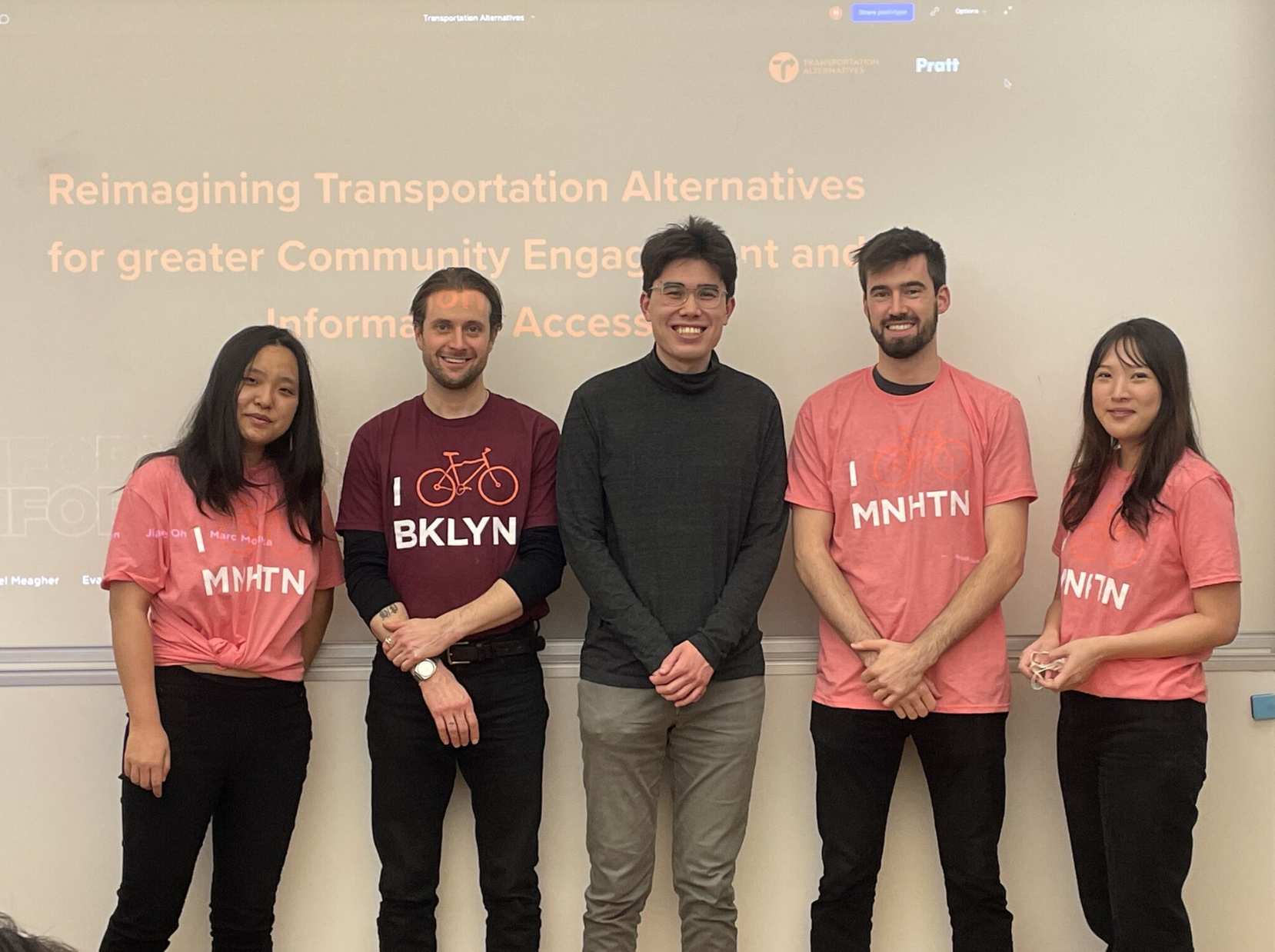
Team: 2 UX Researchers & 2 UX Designers
Client: Transportation Alternatives
My Role: User Researcher, Information Architect, Content Strategist, Concept Development, Prototyper
Duration: Ten months
Setting the Stage
Background Research on organization and mission
Facilitated initial client meeting to identify stakeholders’ goals and agenda.
Project Requirements and Parameters
Showcase previous and existing work.
Improve the membership and donation experience.
Site must be designed within Squarespace confines.
UXR and analytics to inform marketing
Process Overview
Project Goals
Encourage people to get involved as supporters, volunteers, and activists.
1
Improve the Information Architecture and overall usability of the TA site.
2
Increase user engagement/awareness of TA goals and get the existing target audience more involved. Expand target audience.
3
Research Goals
Identify Key User Behaviors on the website and gain a deeper understanding of their opinions and perception of TA as an organization and understand how that is aligning with TA’s mission
1
Identify Key Painpoints users are experiencing on the website during their user journey.
2
Identify how users are interacting with key actions and certain pages on the website.
3
Discovery Phase
To familiarize ourselves with the visual language, content flow, and information architecture of TA's website, we conducted a Technical Analysis of the current website content.
Ecosystem Map
After completing a technical analysis our next step was to develop an ecosystem map that identified all the parties involved in the operations of TA. Understanding TA's impact and use cases expanded our view of the organization beyond its website.
The technical analysis is created to evaluate current websites’ Information architecture, contents, Visual Design & Interaction Design.
We reviewed each top-level navigation page and their associated sub-navigational pages to get a comprehensive insight into the existing Transportation Alternatives web presence.
Following a thorough assessment of the existing TA website design and its user base, we formulated a strategy to define our design approach.
Methodology: Interviews and Usability Testing
We conducted Moderated Interviews and Usability Testing with 6 volunteers over Zoom to gain key insights into how users navigate through the TA site.
4 volunteers were recruited with the help of TA
2 participants were recruited via our personal networks, choosing participants who had some baseline familiarity with TA.
Key Findings:
Based on our six usability tests, we identified the following key issues:
The majority of participants found it difficult to describe the difference between donating and becoming a member based on the website information.
TA’s homepage message does not clearly convey what they are, what they offer, or what the mission is.
The process of joining a particular committee can be challenging and is not straightforward.
There is a lack of regular updates to the event/news content, which may result in a loss of traffic or losing the trust of users.
Consolidated Categories:
To make it easier for users to find key information. Key areas: resources, news, about
Added borough-specific navigation
During our user testing, we learned that users want an easier way to locate information about their own boroughCreated Resource Hub
to ensure there is an easy way to find key information for usersRemoved membership & search from top level
Consolidate membership and donation forms: The search function did not work
Information Architecture
Our first step after assessing our research data was to reorganize TA's Information Architecture.
During our user interviews, we found that many users were frustrated with buried information and inadequately labeled, redundant pages. To address this problem, we consolidated the pages to create a more streamlined user experience.
Concept Development
Given the organization’s stated goals, our own analysis, and the information we have analyzed from our research, we have a strategy that falls into four distinct categories of improvement. Our main intention is to improve the way the TA website functions as an informational resource for new users, as a hub for existing and prospective members, and as a pathway for donations and memberships.
Our strategy focused on four categories of improvement:
Consolidate and Better Define the Donation and Membership Flow
Clarify Information and Definitions for New Users
Improve Access to and Functionality of Borough-Specific Pages
Manage Events and Highlight Other Channels
Visual Design & Interaction
The following are the key user flows related to the problem areas we identified during the research phase:
Problem Area 1: Information Access and Onboarding
There are three ways in which we can address information access and onboarding. The first step was to redesign the homepage by creating a captivating and actionable splash page that made it easier to scan the information, and by using section headers to make it more readable.
TA's updated "About" page was designed to help with onboarding users by contextualizing TA’s past, present, and future.
In addition, we developed a new "Resource Hub" in order to provide a central location for information and action. In addition to providing quick access to various communication channels, such as Slack and Twitter, TA's Resource Hub also balances its unique blend of online and offline activity.
Problem Area 2: Improving Access to Committees and Boroughs
The second phase of our redesign focused on improving access to borough-specific pages and making it easier for users to join committees within their own boroughs
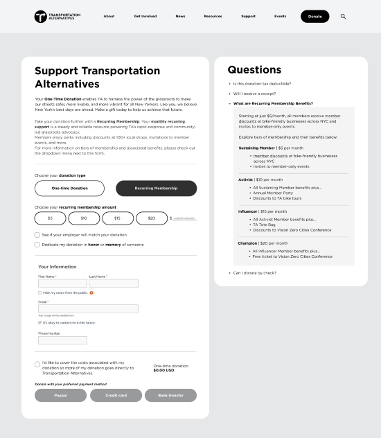
Problem Area 3: Donate and Membership Flow
Finding:
Users could not tell the difference between a donation and a membership and why they should spend their money on one or the other.
"This page doesn't really say what the membership is, just seeing the benefits."
Recommendation:
Our recommendation was to consolidate donations and memberships into one flow, on one page on the TA website. In order to donate or join, users have to navigate between two different TA pages and two different third-party vendor pages. This introduces too much confusion, which discourages users from donating.
Outcomes
During the design phase, the following themes emerged from our user research findings:
Using images to contextualize text rather than separating them.
The introduction of hierarchy and the creation of content sections with headers.
Organizing and consolidating information to facilitate scanning and clarity.
Key Takeaways & Lessons learned
I learned a great deal during this project from the initial research phase to improving my ability to synthesize data findings into actionable design decisions based on our research findings. It was an absolute pleasure working with Transportation Alternatives, especially the ability to take a full project from initial research all the way through executing and implementing our design.


