Utilizing Eye-Tracking Data to Improve Pratt’s Mobile Website Usability
Project Overview
Pratt Institute recently redesigned it’s main website. My team, which included four members, was tasked with testing the overall usability of their mobile website for prospective undergraduate students using eye-tracking.
Using eye-tracking technology we were able to identify problem areas and make recommendations based on those key insights.
My Role
• Collaborated with a team of 4 to develop a research plan to test the usability of the main Pratt Institute mobile website.
• Member of the Research Ops team - responsible for recruiting participants for the study.
• Moderator for eye-tracking sessions.
• Analyzed data from the eye-tracking study and drew key insights into the usability of the mobile website.
• Presented findings to designers & stakeholders.
Client: Pratt Institute
Team: 4 UX Researchers
Project Duration: Oct 2022 - Dec 2022
Tools: Tobii Pro Eye Tracking, Figma, Miro, Google Suite
Project Goals
Understand how users browse the Mobile website.
1
Understand what areas on the mobile website are working well and identify problem areas.
2
Determine if the homepage is effectively guiding users to key information they are looking for.
3
Process
Research Methodology
Methods of Analysis to Gain Key Insights
Moderated Usability Testing
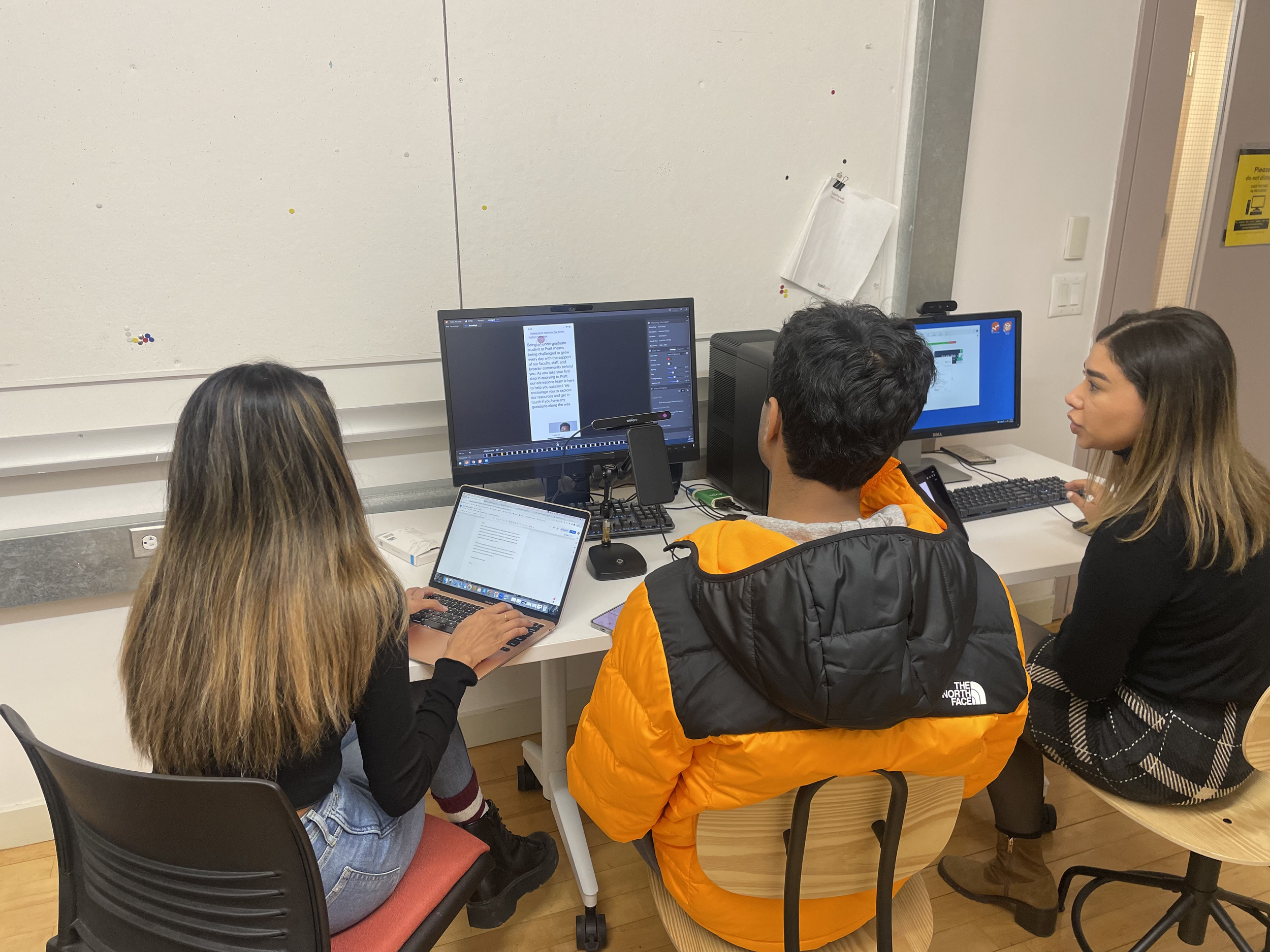
In-person testing sessions in the lab where participants were given four tasks to complete on the Pratt website during in-person testing sessions in the lab.
Tobii Eye Tracking
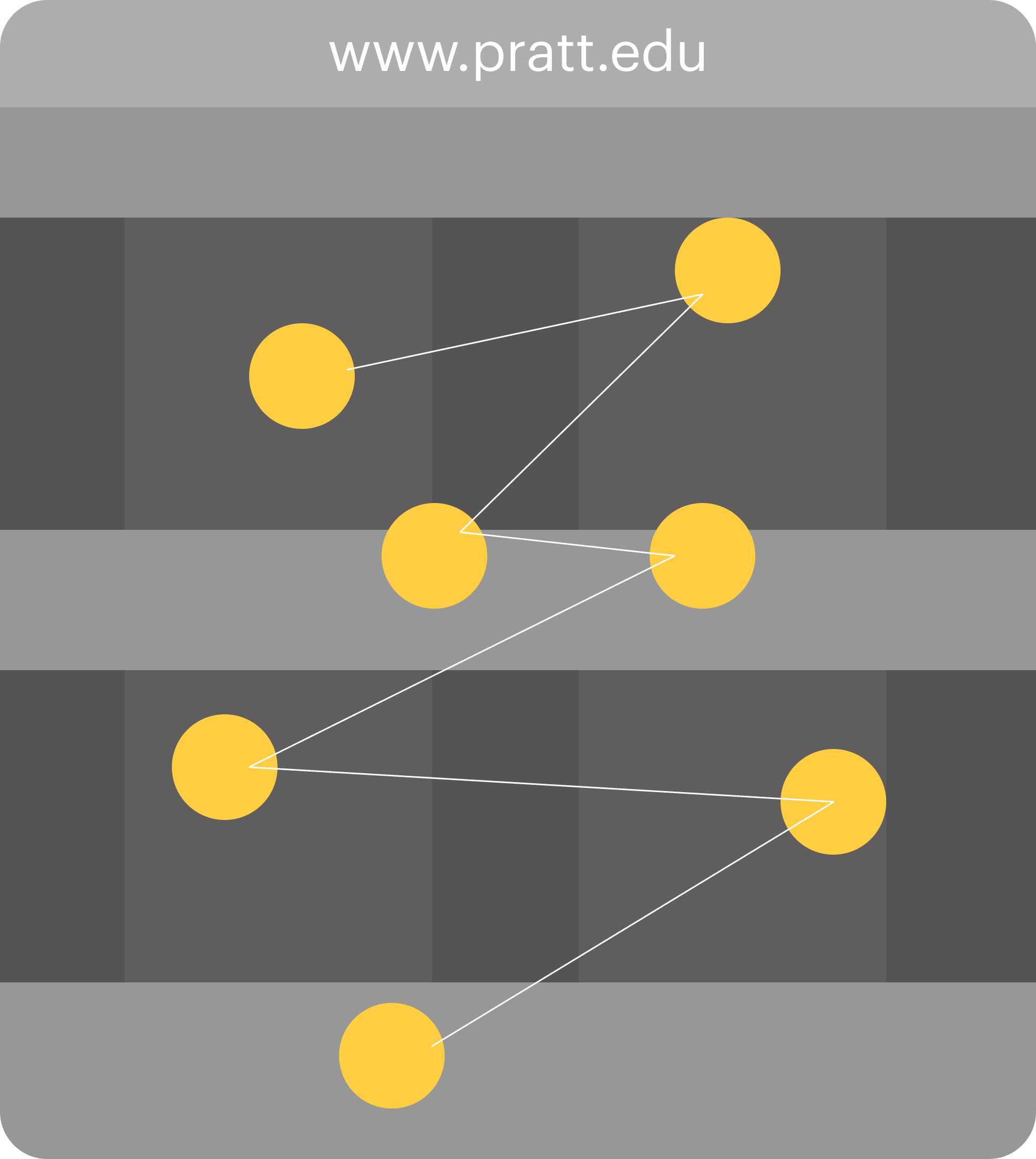
This device was used to capture information such as fixation, saccade, gaze vector, and gaze point for each eye.
Retrospective Think Aloud
Participants were shown a gaze replay and asked to tell us how they performed the tasks aloud by narrating their thought process.
What is eye-tracking?
Eye-tracking is a methodology that helps researchers understand visual attention.
An eye tracker is a tool that allows UX researchers to observe the position of the eye to understand where an individual is looking.
It tracks the location, duration, and movement of the eye which gives us data about the hierarchy of gazes, the length of a gaze, and where the gaze was specifically situated.
Participant Profile
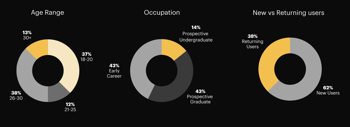
There were several challenges we faced in the recruitment process. Initially, our target audience for the study was prospective undergraduate students who were currently 18 years of age or younger.
Additionally, when selecting participants we had to be sure to avoid selecting participants who either wore bi-focal or varifocal lenses as they would interfere with the eye tracking software.
Setting the Stage / Research Questions
As a team, we prepared a list of several research questions to understand how prospective undergraduate students were using Pratt’s Mobile website to access key information:
What actions do prospective undergrads take when they’re thinking about applying?
Does the homepage accurately communicate to new prospective students what Pratt is and what it offers?
How effective is the navigation at directing prospective students to discover information about admission requirements?
How effective is the undergraduate page at guiding prospective students to the information they need?
Results
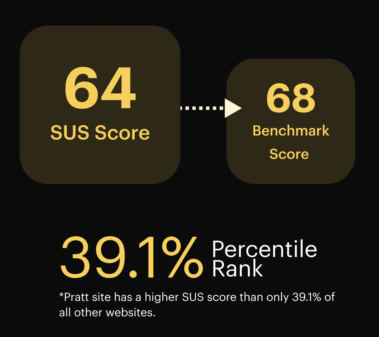
Through our analysis, we were able to determine and understand our SUS (System Usability Score) along with other key metrics:
Analysis & Synthesis
High-level Findings: Overall
We collected both Qualitative & Quantitative Data
Based on the data we collected from the eye-tracking study, we learned from our participants that the website was easy to learn but difficult to use.
Quantitative Data:
Qualitative Data:
Key Areas of Improvement:
Navigation Guidance
1
Meeting User Expectations
2
Key Finding 1.1: Unclear Submenu Function
The submenu does not have a proper indication that it does the following:
Users were unclear of the submenu’s functions and were left searching for wanted information.
Drop down to another set of items
1
Navigates to a new page
2
This caused users to continue scrolling in search of keywords that had been dropped down already.
Recommendation 1.1
Indicate dropdown content with the use of dropdown icons
Key Finding 1.2: Lack of Menu Hierarchy
Lack of hierarchy and similar menu options caused users to click through the different options before landing on the page that had the information they needed.
This caused users to continue scrolling in search of keywords that had been dropped down already.
Drop down to another set of items
1
Navigates to a new page
2
“... seemed disorganized in the sense of categorizing... I couldn't figure out exactly which side I should be looking at... forced me to click multiple things..." - Testing Participant
Recommendation: 1.2
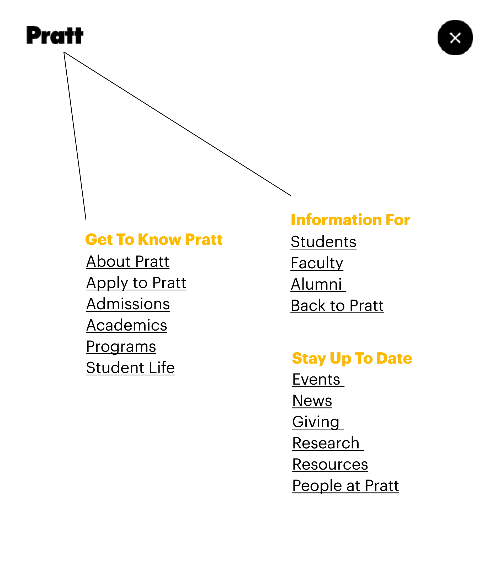
Organize Menu list into 3 categories:
Information for prospective students
1.
Specific Information for current students, faculty, and alumni
2.
General Information for the Pratt community
3.
Key Findings 2.1: Meeting User Expectations
Information Is Not Where Users Expect to find it
The Programs page lacks crucial information that participants wanted to see
3 out of 8 participants said they expected to find information about course options, application deadlines, program requirements, and portfolio requirements and on individual program pages
Key Findings 2.1: Meeting User Expectations
Information Is Not Where Users Expect to find it
"One thing that was missing for me was ‘does this deadline apply to every program, including my program?’"
"I was thinking that I would find a requirement related to the program directly from the program page and not needing to go back to the overall undergrad admissions area.”
“Seems like the page itself or architecture program doesn't give me that information."
Recommendation 2.1
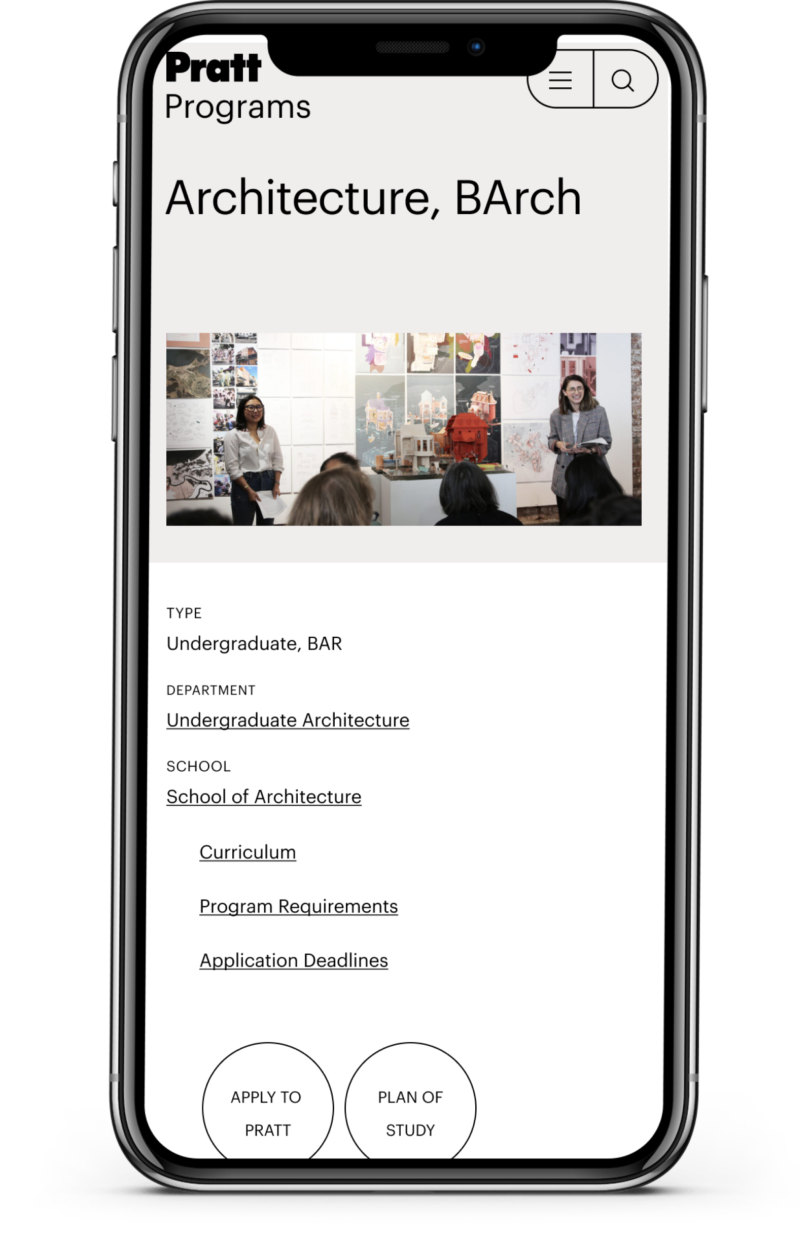
Add additional Key Information to the Programs page that prospective students want to see:
Add the following categories to the submenu:
• Curriculum
• Program Requirements
• Application Deadlines
1.
Move “Apply to Pratt” button and
“Plan of Study” button up one level in the hierarchy -- 3 participants said they would like to see this without scrolling
2.
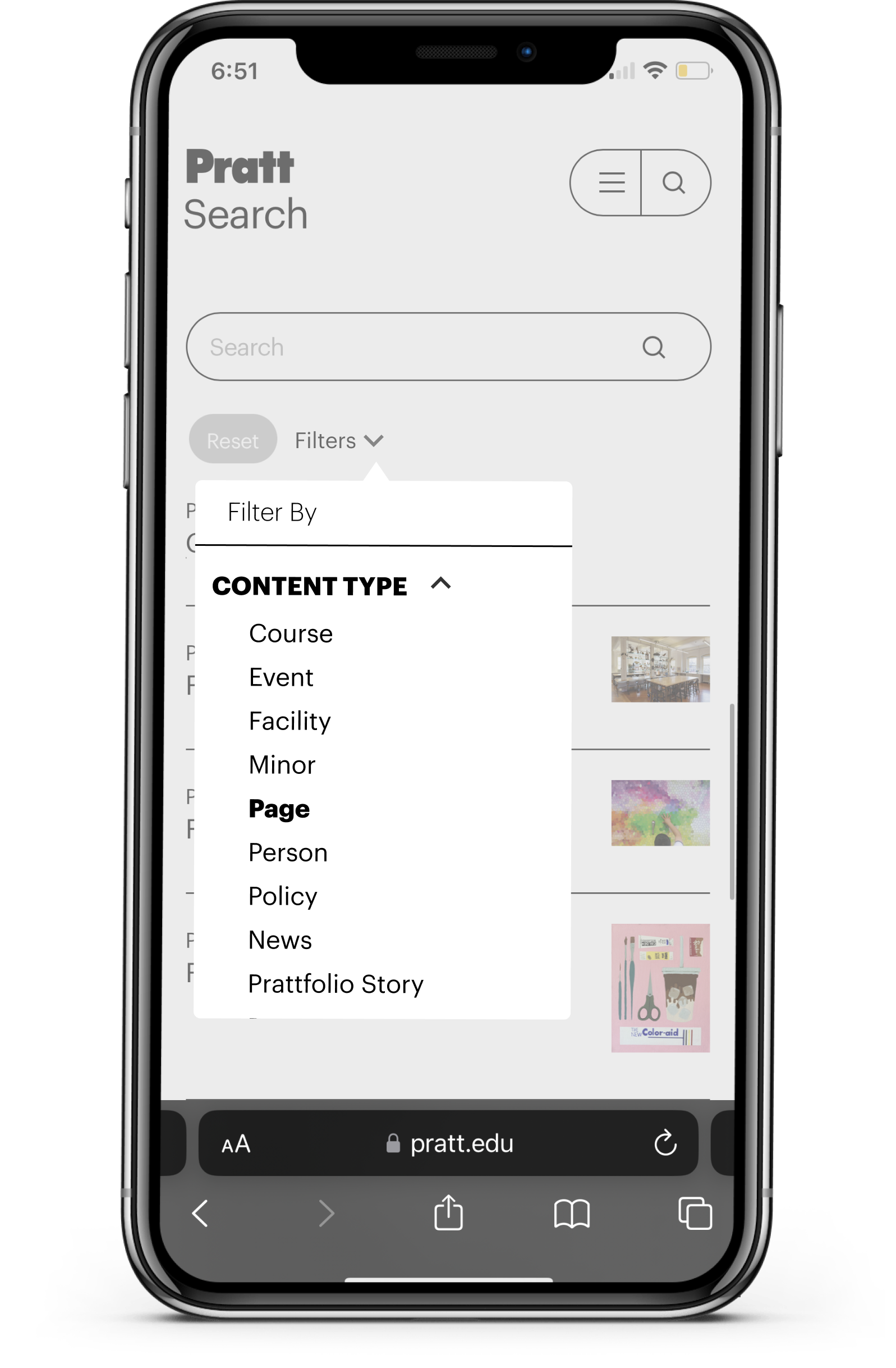
When using the search tool, users struggled to realize that their search results were generating below the fold
Key Finding 2.2: Abandoned Search Queries
“ I want to find results quick...”
Most participants viewed and interacted with filters. Only a few scrolled past the filter to view their results.
Key Finding 2.2: Abandoned Search Queries
Recommendation 2.2
Strategic display of search filters:
Opt for overlay functionality for the filter, which will result in seeing search results and auto-suggestions above the fold.
1.
Client Meeting & Next steps:
We received valuable feedback during our final client meeting. The clients found our research, findings, and recommendations insightful and plan to look further into the problem areas we have outlined.
For the Next Steps, we recommend implementing our key recommendations and then following up with A/B testing as well as conducting more research on specific metrics obtained through an analysis of Google Analytics metrics. It’s also crucial to do more research on other specific flows on the mobile website that need more attention as well. Lastly, it’s recommended to employ other methods to evaluate the Information Architecture. Specifically, doing an open card sort to gain a better understanding of how users are thinking about navigating the mobile site.


