Improving Access to Key Information for the National Gallery of Art.
A Usability Case Study
Project Overview
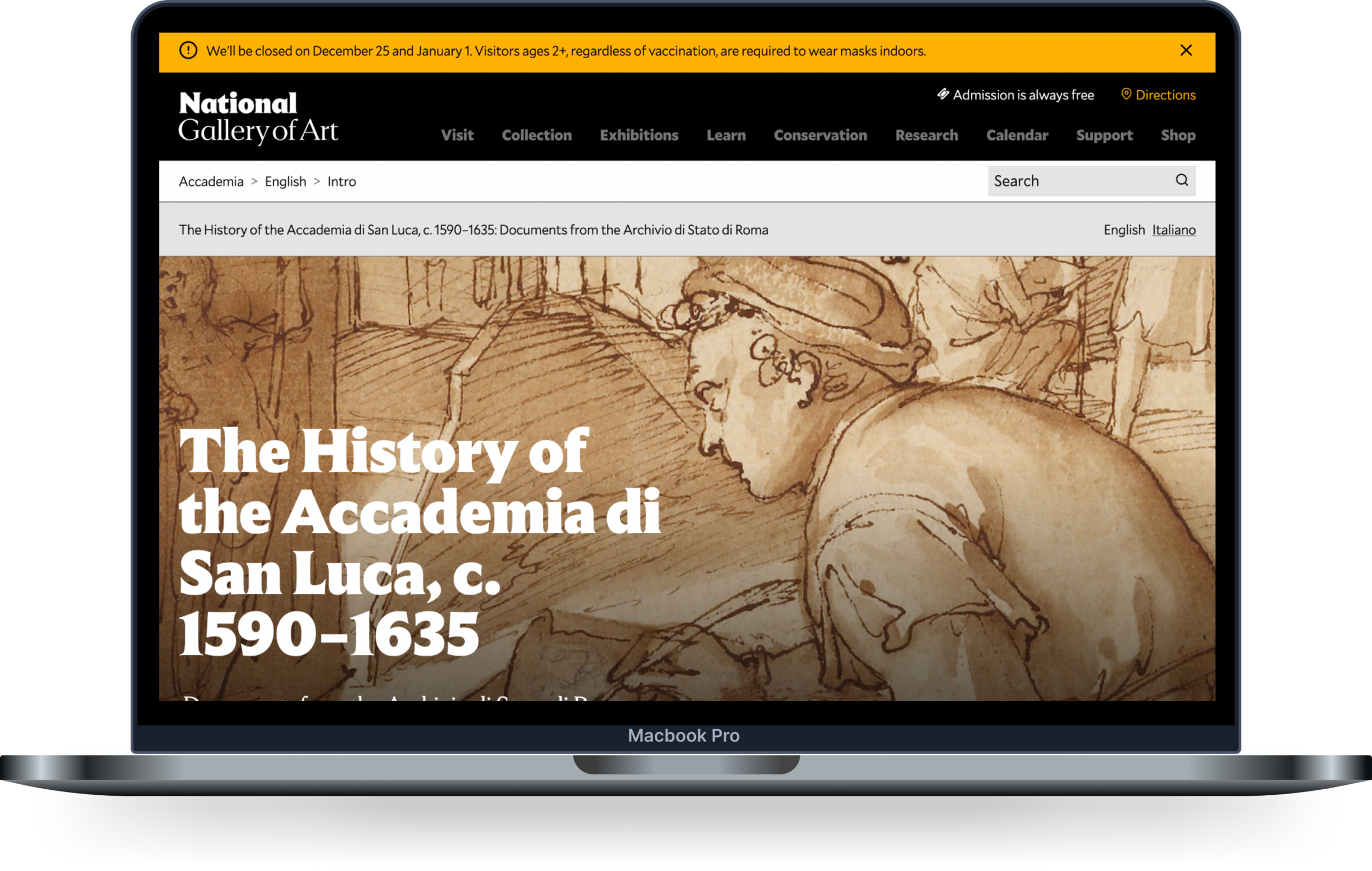
The National Gallery of Art (NGA) is a historic cultural institution that strives to improve its online resources for academic researchers. This particular project was designed to improve the usability of the NGA's The History of the Accademia di San Luca, c. 1590–1635: Documents from the Archivio
Originally launched in 2010, the website is maintained by the National Gallery of Art. This case study explores the current usability of the Accademia di San Luca website, as well as ways it could be improved.
Research Team
The Research Team consisted of four User Experience (UX) consultants, who conducted seven moderated user tests.
The test participants, who possessed varying levels of knowledge regarding the Accademia di San Luca, were given a specific list of tasks to follow while navigating the website. 71% of tested users would recommend the Accademia di San Luca website to colleagues with similar interests. Those familiar with online research databases like the ASL were more likely to find the ‘search tool’ easy to use. However, participants encountered usability issues related to navigation, search features, and the map tool throughout testing that impacted their interactions with the ASL website.
1. Planning
Determining Goals
Creating Tasks, Testing Script & Consent form
Writing Pre & Post Test Questionnaires
Process Overview
2. Recruiting Users
Identifying Target User demographic
Communicating with participants
Scheduling testing with participants
4. Analysis
Identifying patterns
Analyzing Data
3. Test Execution
Moderating User Tests
Taking Notes
Recording Session
5. Reporting
Synthesizing data and reporting findings and recommendations
Creating final report
Presenting to the client
The Challenge
Our challenge was to evaluate the usability of the National Gallery of Art’s (NGA) website for the Accademia di San Luca.
The NGA informed us that they would like to explore ways to enhance the value of the information that we have today.
In developing this project, the National Gallery of Art targeted historians/researchers, teachers, and students.
Our clients provided us with four users who were already familiar with the ASL website. The other three participants were recruited by my team members and I reached out to history/art history degree holders. Participants included teachers, museum professionals, and students. Interviews were conducted using Google Meet over the course of two weeks.
Project Goals
Our project goals were established during our initial meeting with our clients at NGA:
Discover what updates could be made to the current site.
Get more additional research with our user base.
Evaluate the existing site’s usability and functionality.
Understanding audience needs and pain points.
Provide actionable solutions to the client.
My Role
My responsibilities included:
Interviewing clients for our initial meeting
Moderating two user tests on Google Meet
Taking notes for two of our user tests
Writing Tasks for Usability Testing
Co-authoring findings & recommendations
Creating and designing wireframes in Figma
Data visualization
Building our presentation and reports
Presenting to the clients
Challenges
As part of the recruitment process, we experienced difficulty recruiting users who were familiar with art or historical archival databases. In addition, while the Center for Digital Experiences offers participation rewards to participants, the National Gallery of Art is not permitted to do so, so we were unable to offer any incentives to potential testers. However, we still managed to enroll seven participants in our study.
For this project, the National Gallery of Art targeted historians/researchers, teachers, and students. Fortunately, we had access to four users who were familiar with the ASL website. The remaining three participants were recruited through my team members and my own outreach to history/art history degree holders. Participants' occupations ranged from teachers to museum professionals to students. The interviews were conducted over a period of two weeks using Google Meet.
Target User Demographic
Our initial meeting with the client and preliminary research enabled us to establish three target user groups to participate in our study.
Our client supplied the first four users, and we recruited the other three, keeping in mind that participants should have a background in art and be familiar with archives. The majority of participants were familiar with the website, while three participants said they had never used it.
Academics & Researchers
Primary Target User
Teachers & Professors
Secondary Target User
Students
Tertiary Target User
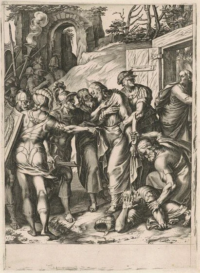
Cornelis Cort, after Girolamo Muziano The Betrayal of Christ 568, engraving on laid paper.
Task List:
Questions were carefully designed to be very specific to certain areas of the website, for example, directing users to the search bar or to the map tools.
Based on what you already know about the website, find something you are interested in.
Find out what year the Rest on the Flight into Egypt etching by Carlo Saraceni was created.
Locate the Federico Zuccaro drawing Disputation of Saint Catherine of Alexandria and find out the approximate year it was created.
Where would you find archival documents associated with the church of San Luigi Dei Francesi?
Find the map by Joachim von Sandrart and Giovanni Battista Falda from 1677 and locate the Farnese Palace.
Find the transcription for the Die 30 mensis Martii 1593 document.
You need to reference the Roma con li forti map. Find where you can see this cartouche.
Please identify the difference in medium between the Der Statt Rom, from Cosmographei and Disegno nuovo di Roma moderna maps.
You're interested in writing a research paper on Alessandro Agazzini, find out how many places he is associated with in his artist profile.
**Users were also asked Pre & Post-Testing Questions for further research analysis.
Remote Moderated User Testing
The test was conducted remotely through Google Meets with seven participants. All participants consented to the recording of the entire session. We urged all participants to think out loud when completing and rating the tasks. The participants were assured their feedback would be valuable to the study, and their feedback was significantly valued throughout the testing session.
The notetaker observed the participant using the “concurrent think-aloud” method while navigating through the interface. A Google sheet was used to record and analyze all notes.
Results / Findings
Post-Test Questionnaire proved to be an effective way to collect important information regarding users' opinions of the ASL website.
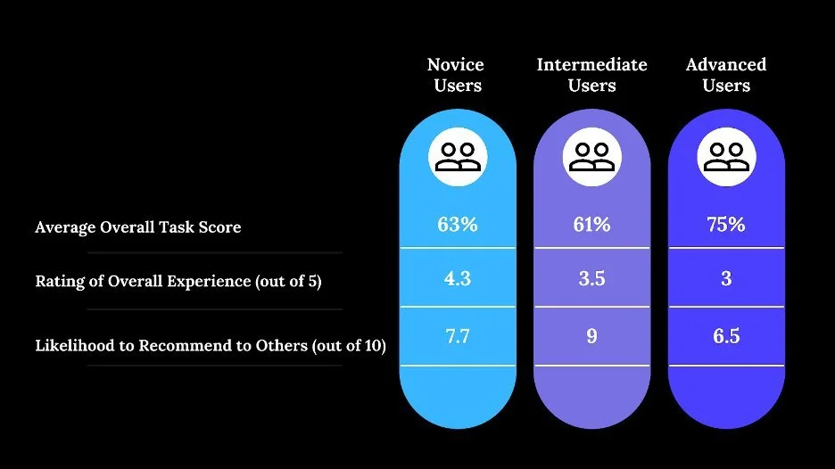
A total of three groups of participants were created: novices, intermediates, and advanced users. Interviews were conducted with three novice users, two intermediate users, and two advanced users.
The majority of novice users were most likely to potentially recommend the site to colleagues with similar interests (7.7/10), while advanced users who had previous experience with the ASL were least likely to recommend the site (6.5/10).
Additionally, Advanced Users rated the overall experience an average of 3/5, compared to Novice Users who rated the overall experience 4.3/5.
Information Architecture
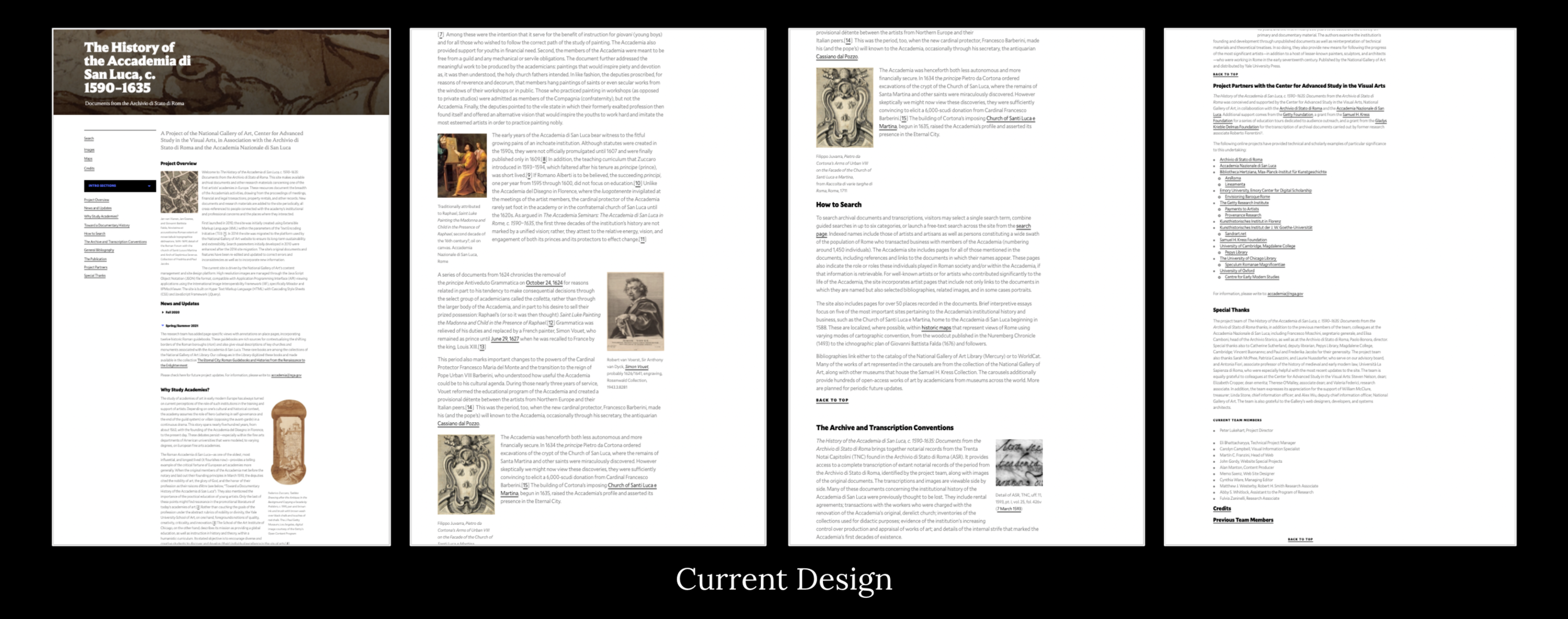
On the original homepage, the ASL navigation bar was located to the left of the page. It is possible to navigate between sections from the sidebar; however, the bar does not follow the user as they scroll down the page, nor is there an option to scroll to the top. Although the information on the page is valuable, its design is not ideal.
Additionally, the site's "breadcrumbs" are not easy to navigate. Currently, they appear above the site's title, and on the homepage, it reads "Accademia > English > Intro", which is not an actual path.
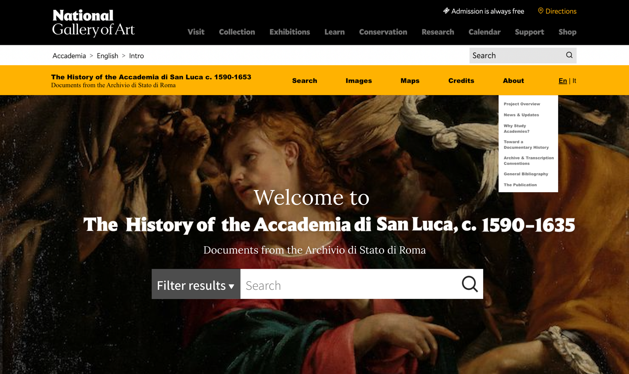
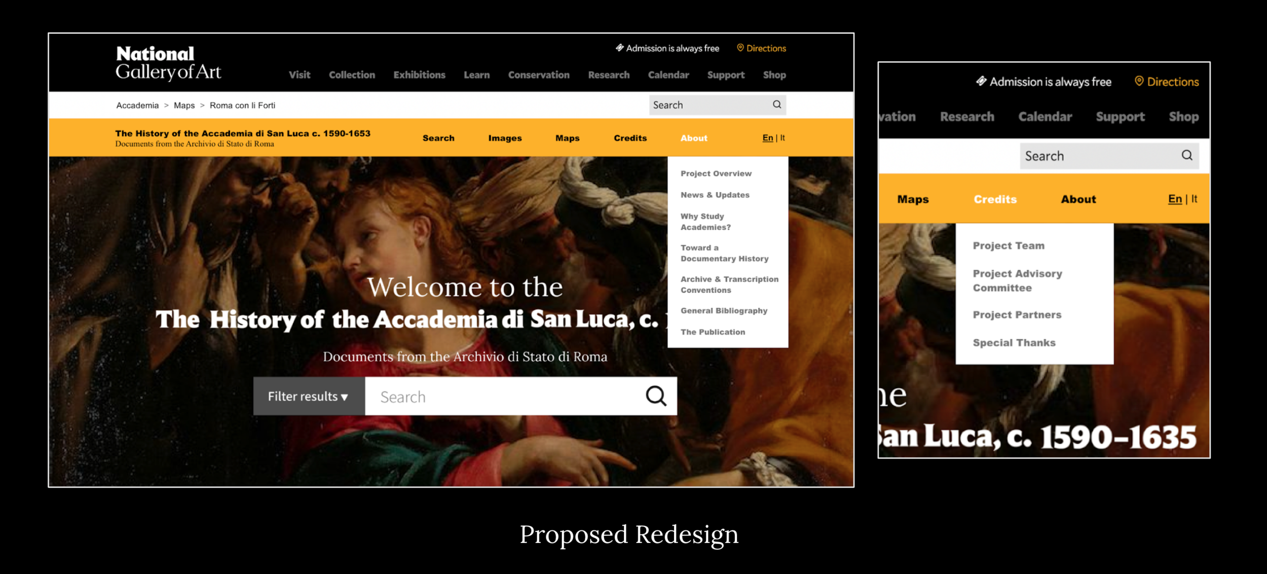
We recommended that the NGA reorganize the homepage's navigation layout by replacing the sidebar with a header navigation bar and reworking the breadcrumb operations throughout the website.
A long screenshot of the current Accademia di San Luca homepage
Usability Recommendations:
Finding 1:
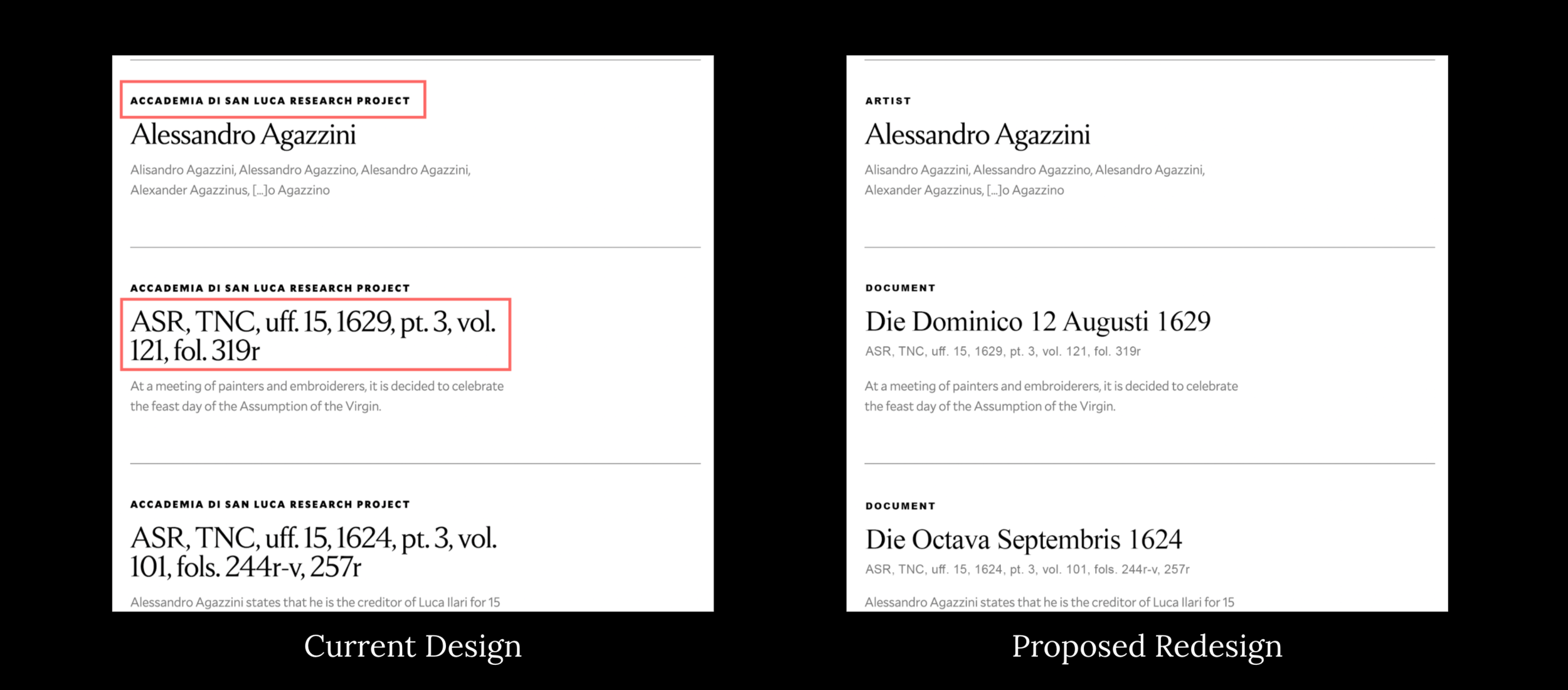
Users found the search features and functionality challenging to navigate and reported it was not only confusing but disconnected and unintuitive. Our usability tests revealed that users were confused by having multiple different search fields and filtering options
Recommendations:
Add proper search and filter functionality to the main Maps page to allow users to find the information they are looking for.
1a. Use a web analytics tool (Google Analytics or other) to determine what users are searching for.
This could provide insight into which filters will be used in the search dropdown on each individual page.
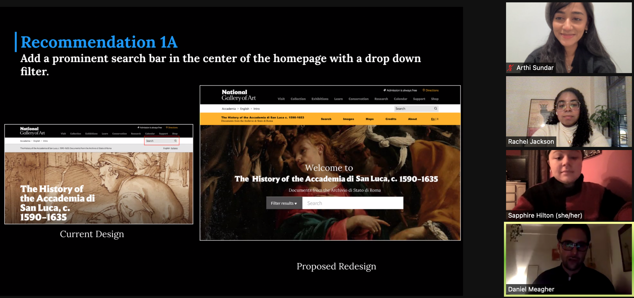
1b. Integrate all search fields into one and add tabs and drop-down options so users can refine their search based on artist, document type, and other parameters
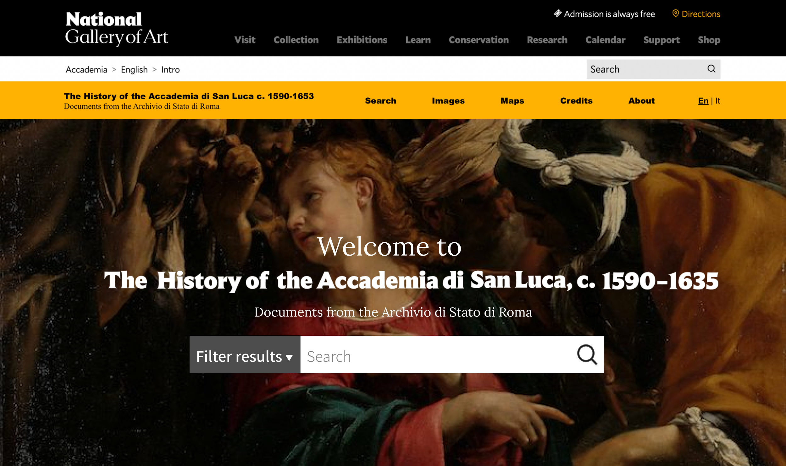
2c. Add a prominent search bar in the center of the homepage for maximum visibility and accessibility.
Finding 2:
Users are not able to easily navigate through the site and the organization of content on these pages causes frustration.
Recommendations:
To provide users with a solid wayfinding structure, it is recommended that consistent navigation be visible on all ASL site pages.
2a. To improve the organization and declutter the content on the homepage, we recommended that the content be split up into individual pages accessible through the tabs in the main navigation. Create consistent navigation & simplify breadcrumbs.
2b. Break up homepage content
2c. Revise Search Results
Finding 3:
Maps: Although a favorite element of the archive, users reported difficulty using Maps tools, as we learned from most participants inability to complete tasks involving the map.
Recommendations:
Add proper search and filter functionality to the main Maps page to allow users to find the information they seek.
Users were tasked with finding, comparing, and looking at various maps throughout the archive. A substantial amount of users conveyed they were confused because of the following:
The main maps page is missing search and filtering functions.
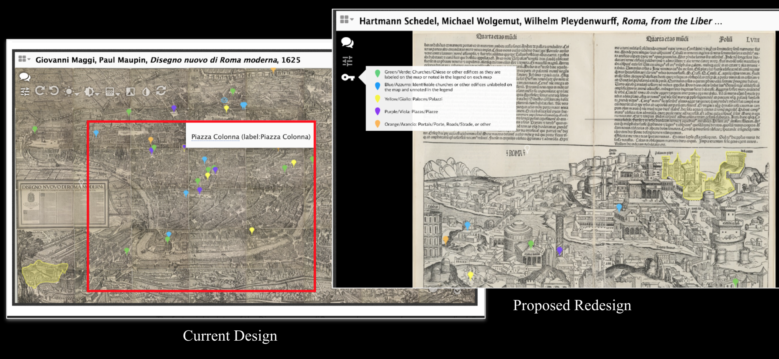
The interactive map tool did not have a legend when displaying the map; instead, users had to exit the tool and read the legend in the description.
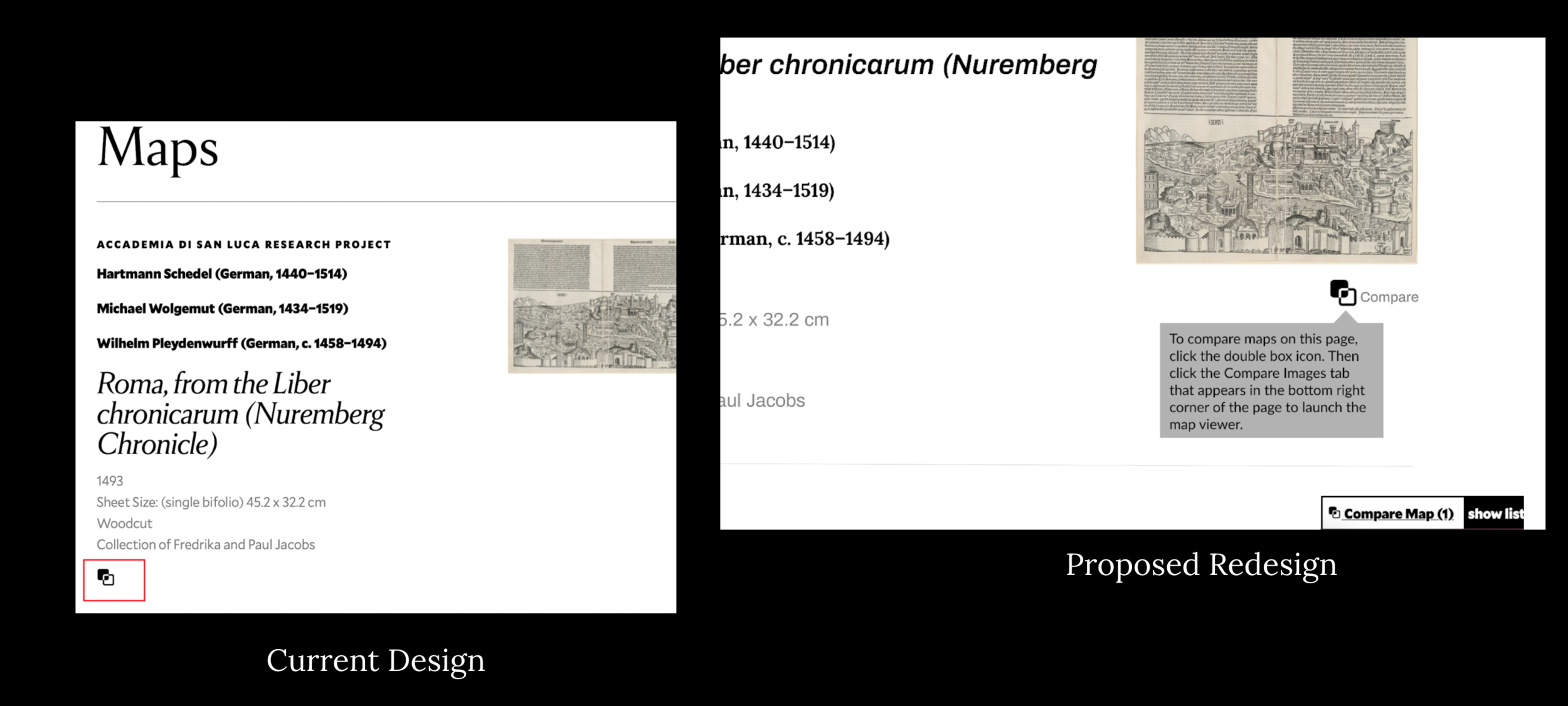
Many users did not use the comparison tool because of low discoverability.
3a. Add consistent search and filter functionality to the main maps page.
3b. Add a key to the annotations on the interactive map itself.
3C. Increase discoverability of the “compare map” tool.
Key Takeaways
The client was very pleased with our findings and recommendations regarding usability. The client appreciated our efforts to produce, moderate, and summarize these deliverables. Additionally, they acknowledged our work and informed us that their next step is to share the report with the site owners since this is the first user test conducted on the website. This is particularly useful data. They anticipate that they will be able to implement some of our recommendations when redesigning the website.
They asked whether or not there were any additional findings, and there are:
The mobile architecture is not intuitive because the site navigation is currently being displayed at the bottom of the page. This makes it very difficult for users to use the search feature or see any other pages within the site.
The layout of the artist profile pages (especially those without images) is very spaced out to the point where no content is visible above the fold of the page. Users were expecting to see at least one result above the fold to indicate more to scroll down to see.
Conclusions
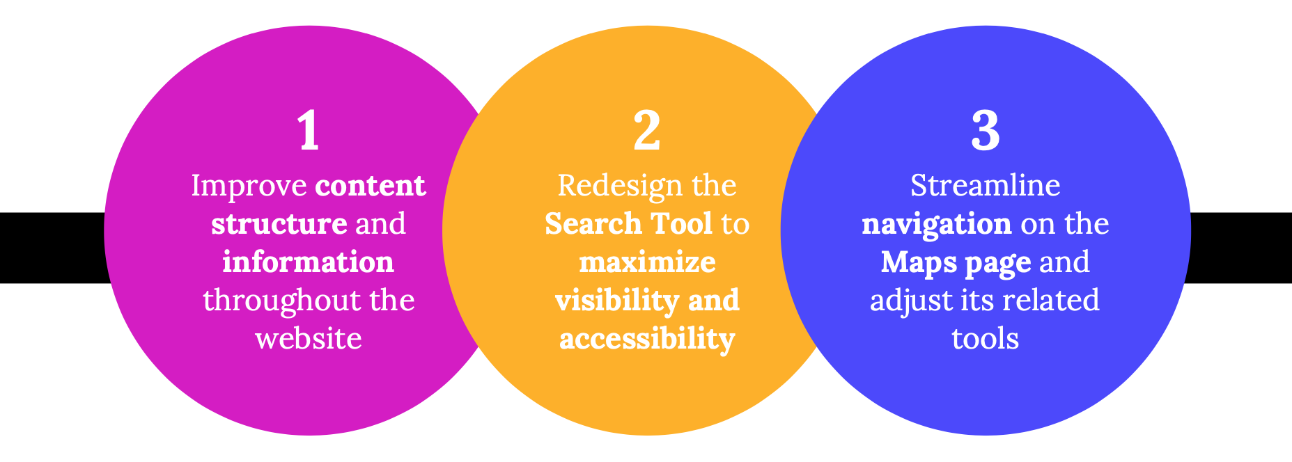
This usability report was created to improve the offerings of the National Gallery of Art's Accademia di San Luca website. We categorized the website's usability into three primary categories: maps, navigation, and information architecture.
The National Gallery of Art should concentrate its efforts on:
Refining the Map page’s overall navigation, create and improve related tools
Add a search and filter function to the main page
Present new users with a short tutorial on how to use the interactive map tool
Improve the discoverability of the map comparison tool
Maximizing the Search tool’s visibility and accessibility
Consolidate the number of search fields by integrating tabs and drop—
down search refine options
Create a prominent search bar for the Accademia di San Luca’s Homepage
Add a site search bar for each web page in a consistent area
Use web analytics to determine what users are searching for
Streamlining the website’s information architecture
Restructure the Breadcrumbs layout
Use consistent navigation visible on all ASL web pages
Switch the vertical sidebar navigation to a horizontal header navigation
These listed recommendations should greatly improve usability for Accademia di San Luca's target audience, as well as new first-time users.
Presentation Meeting with the National Gallery of Art team
Following our presentation of the findings of our research and user testing, we had a discussion to clarify any additional points and answer any questions they might have.
Next Steps
Conduct additional user testing with novice users to get first impressions of the site (both web & mobile)
Create a strategy and structural design with stakeholders.
Launch & asses usability of new design with more user testing following.
